
Trew Landscape Blog
The Best Holiday Light Color Combinations for Every Style Home
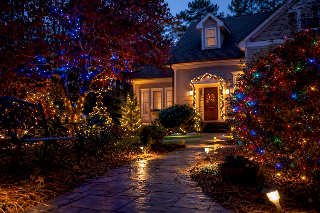
The Best Holiday Light Color Combinations for Every Style Home ! House decorated with classic red, green, and warm white holiday lights The fastest way to ruin a holiday display isn't picking the wrong colors.
The Best Holiday Light Color Combinations for Every Style Home
The fastest way to ruin a holiday display isn’t picking the wrong colors. It’s picking the wrong white. Start with a warm-white base (around 3000K), add one confident secondary color, and finish with a small accent. That single decision fixes most of what makes displays look cluttered instead of intentional.
If you want to skip straight to a look, here are eight combinations that work:
- Classic red and green with warm white trim, for a traditional front-yard feel
- Warm white, gold, and deep red, for an upscale, magazine-cover look
- Blue and gold, for a winter-wonderland effect on brick or stone homes
- All warm white, for a modern, minimalist glow
- Red, blue, and gold (triadic), for a bold but balanced multicolor statement
- Blue, teal, and purple (analogous), for a cool, moody nighttime look
- Green, lime, and gold, for an organic, nature-inspired display
- Controlled multicolor, for playful displays that still read as designed, not random
One caution before you shop: never mix different white color temperatures on the same roofline, tree, or railing. A warm-white string next to a cool-white one on the same surface reads as a mistake, not a design choice, according to guidance from Christmas Lights HQ.
TL;DR:
- Using a warm-white base around 3000K is essential for a cohesive and flattering holiday display, and mixing different white temperatures on the same element should be avoided.
- Following the 60/30/10 color ratio and choosing colors based on the mood or scheme creates a balanced, intentional display rather than a chaotic one.
- Testing color combinations at dusk from the street before large purchases helps ensure the display reads well from a typical viewing distance.
- Residential installations benefit from professional help to maintain Kelvin consistency, precise ratios, and safe ladder work, enhancing the overall look and durability.
- Trends favor restraint with single focal colors and programmable lighting systems, moving away from cluttered, multicolor yard displays.
Table of Contents
- 8 Holiday Light Color Combinations and Where to Use Them
- Color Temperature (Kelvin) and Why the White Matters
- Design Rules: Color Theory, the 60/30/10 Ratio, and Rhythm
- Matching Your Palette to Your House and How It Photographs
- Where Holiday Lighting Trends Are Headed
- Trew Landscape’s Approach to Holiday Lighting
- Why Restraint Beats More Colors
- Get Your Holiday Lighting Done Right the First Time
- Key Takeaways
- Sources
- FAQ
8 Holiday Light Color Combinations and Where to Use Them
Choosing among holiday light color combinations gets easier once you think in terms of placement, not just preference. Here’s where each palette earns its keep.
1. Classic Red and Green with Warm White
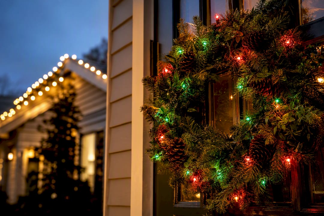
The oldest combination in the book still works because red and green sit opposite each other on the color wheel, a complementary pairing that guarantees contrast. Run warm white along the roofline, save red and green for wreaths, garlands, or shrub wraps. Reads well from 30 feet or more and photographs cleanly against most siding colors.
2. Warm White, Gold, and Deep Red
Keeping every color in the warm spectrum creates a nostalgic, upscale look that design guides describe as a genuine Christmas card aesthetic when the palette stays curated rather than crowded. Use warm white on the roofline, gold on trees or columns, and deep red sparingly on the front door or a single focal shrub.
3. Blue and Gold Winter Wonderland
This pairing suits homes with brick, stone, or gray siding. Blue reads as icy and serene, gold warms it back up so the display doesn’t feel cold. Best on rooflines and large trees; avoid pairing cool blue with warm-white icicles, since the temperature clash undercuts the effect.
4. Monochrome Warm White
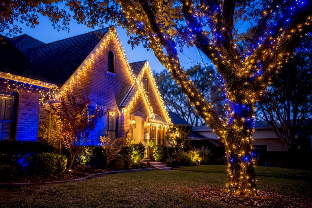
An all warm-white display is the safest bet for modern homes or anyone worried about looking tacky. It photographs beautifully at dusk and pairs with literally any exterior color.
5. Triadic Red, Blue, and Gold
Triadic color schemes use three colors evenly spaced on the color wheel, and this combination brings genuine boldness without looking chaotic, as long as you follow a dominance ratio (more on that below). Best viewed from the street, not up close.
6. Analogous Blue, Teal, and Purple
Colors that sit next to each other on the wheel blend rather than compete, which is why this combination feels moody and cohesive instead of busy. Works best on homes with dark or neutral exteriors where the cool tones can stand out.
7. Green, Lime, and Gold
An organic, nature-leaning palette that suits wooded lots or homes with heavy landscaping. Lime green as an accent keeps the display from feeling like a generic Christmas tree.
8. Controlled Multicolor
Full rainbow displays can look amazing or look like a yard sale, and the difference is rhythm. Alternate colors in a predictable pattern instead of scattering them randomly.
Pro Tip: Take a step back, literally. Most displays are judged from the street or a passing car, not up close. If a palette looks good from 40 feet away at dusk, it will work. If it only looks good standing next to the bush, rethink it.
Color Temperature (Kelvin) and Why the White Matters
Every white light has a Kelvin rating, and that number determines whether your reds look festive or faded, whether your blues look icy or muddy. Professionals treat this as the first decision, not an afterthought.
| Kelvin Range | Common Name | Best Paired With |
|---|---|---|
| ~2600K | Sun Warm | Deep red, forest green, gold |
| ~3000K | Warm White | Red, green, gold, most classic colors |
| ~4000K | Pure/Neutral White | Blue, silver, modern multicolor |
| 5000K+ | Cool White/Daylight | Blue, purple, icy themed displays |
Professional installers overwhelmingly default to Warm White around 3000K for residential rooflines. It’s flattering on nearly every exterior material and pairs cleanly with the traditional color families most homeowners want. The rule that trips people up every year: don’t mix Kelvins on the same element. A roofline with both 3000K and 5000K bulbs reads as two mismatched product runs, not one design.
Design Rules: Color Theory, the 60/30/10 Ratio, and Rhythm
Complementary colors (opposite on the wheel, like red and green) create contrast. Analogous colors (neighbors on the wheel, like blue and teal) create harmony. Triadic combinations (three evenly spaced colors) create boldness that still feels balanced. Pick the relationship based on the mood you want, not just what’s on sale at the hardware store.
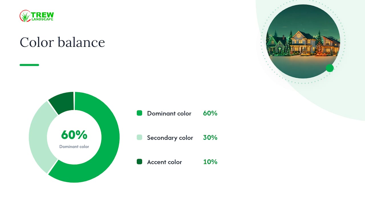
The ratio that keeps any of these from looking chaotic is 60/30/10: your dominant color covers 60% of the display (usually the roofline), a secondary color covers 30% (mid-level features like bushes or railings), and your accent color gets just 10% (a wreath, a single tree, the front door).
- Alternate colors in a 3:1 or 4:1 rhythm along strings, not an even split
- Never distribute three colors equally. One should always dominate
- Mixing white temperatures on one element is the single most common mistake
Pro Tip: If you’re using three colors, pick one as the “hero” and let the other two support it. Equal thirds almost always looks like a mistake, not a design choice.
Matching Your Palette to Your House and How It Photographs
Your siding and brick aren’t a blank canvas. They already have color, texture, and undertone, and your lights either work with that or fight it. Red brick with warm undertones clashes with cool blue lights; it sings next to warm white and gold. Gray or blue-toned siding does the opposite, favoring cool palettes.
- Identify your exterior’s undertone. Warm brick, tan stucco, and wood siding call for warm palettes. Gray, blue-gray, or white siding gives you room for cool blues and purples.
- Consider your neutral zones. Black trim, dark gray roofs, and white siding are flexible and pair with almost any palette you choose.
- Test before you commit. Buy one string of each color under consideration, hang it in place, and photograph it at dusk from the street. Colors read differently in real light than they do on a store shelf or a screen.
Pro Tip: Do the dusk test before ordering bulk quantities. It costs you one trip to the store and saves you from a return line at the register in January.
For homeowners planning where light should hit architectural features long after the holidays come down, our landscape lighting placement guide covers the same principles.
Where Holiday Lighting Trends Are Headed
The biggest shift in recent years isn’t a new color, it’s restraint. More homeowners are choosing edited displays with one strong focal point instead of covering every surface, a trend that holiday lighting trend research ties directly to how well a display photographs and shares.
Smart, programmable systems are feeding that shift. They let you switch from red and green to blue and gold for a New Year’s look without re-stringing anything, though they add setup complexity and upfront cost most single-season displays don’t need. If Kelvin consistency and long-term flexibility matter more to you than a seasonal swap, permanent low-voltage fixtures installed by a professional solve both problems at once.
Trew Landscape’s Approach to Holiday Lighting
Trew Landscape LLC installs seasonal Christmas lighting across Kansas City properties, applying the same Kelvin consistency and 60/30/10 thinking covered above to every roofline, tree, and walkway we wire.
- Warm-white bases matched to each home’s exterior tone
- Rhythm-controlled accent colors instead of scattershot multicolor
- Safety-checked installation on ladders, gutters, and power sources
Getting the color temperature right before the first bulb goes up saves homeowners from re-buying strings mid-season. It’s the one detail that separates a display that photographs well from one that just gets taken down early.
Review our installation safety checklist or the per-foot cost guide before you decide between DIY and professional help.
Why Restraint Beats More Colors
Most homeowners assume a better display means more lights and more colors. The opposite is usually true. A roofline in warm white, a wreath in deep red, and one well-placed gold accent on a doorway tree will outperform a yard covered in six clashing colors, every time, because the eye reads intentional restraint as expensive and chaos as cheap, regardless of how much was actually spent on bulbs.
The other overlooked mistake is treating Kelvin as a minor detail. Homeowners will agonize over red versus burgundy but grab whatever white string is cheapest that week, not realizing that a 5000K string next to a 3000K string on the same gutter line is the visual equivalent of wearing two different whites in the same outfit. Fix the white first. Everything else gets easier after that.
— Trew Landscape LLC
Get Your Holiday Lighting Done Right the First Time
Trew Landscape LLC brings the same design discipline in this article, correct Kelvin pairing, the 60/30/10 ratio, and rhythm-controlled color, to actual installation, so you’re not the one on a ladder in December second-guessing bulb temperatures.

We handle everything from roofline outlines to tree wraps and walkway accents, matching warm or cool palettes to your home’s brick, siding, or stone, and taking the safety risk of ladder work off your plate entirely. If you’d rather have your display planned, wired, and taken down by professionals instead of spending a weekend untangling strings, our Christmas Light Installation service covers Kansas City properties start to finish. For homeowners thinking beyond the holidays, our landscape lighting team can also build permanent, Kelvin-controlled fixtures that carry your home’s glow well past January. Reach out today to get a quote for this season’s display.
Key Takeaways
Warm-white light at approximately 3000K paired with one dominant secondary color and a small accent produces the most professional-looking, photo-friendly holiday display.
| Point | Details |
|---|---|
| Start with warm white | Use approximately 3000K as your base color temperature for most residential rooflines. |
| Never mix Kelvins | Keep one white temperature per element to avoid a mismatched, unintentional look. |
| Follow 60/30/10 | Dedicate 60% to your dominant color, 30% to a secondary, and 10% to accents. |
| Test before bulk buying | Hang sample strings and photograph them at dusk before ordering full runs. |
| Consider professional installation | Trew Landscape LLC applies Kelvin and ratio rules directly during Kansas City installations. |
Sources
- Christmas Light Color Temperature: Complete Kelvin Guide – Christmas Lights HQ
- Christmas Light Trends: Colors, Projectors, Displays
FAQ
What colors will be popular for holiday displays in 2026?
Restrained, photo-friendly palettes with one strong focal color are trending, often paired with programmable systems that let homeowners switch themes.
What are the current trends for holiday lights?
Edited displays with a single standout focal point are replacing fully covered, multicolor yards, alongside growing use of smart, programmable lighting.
What are the 5 main Christmas colors?
Red, green, gold, silver, and white make up the traditional core palette, with warm white typically serving as the base rather than an accent.
Should I hire a professional for holiday light installation?
Professional installation ensures correct Kelvin matching and safe ladder and power work; Trew Landscape LLC offers this service across Kansas City properties.